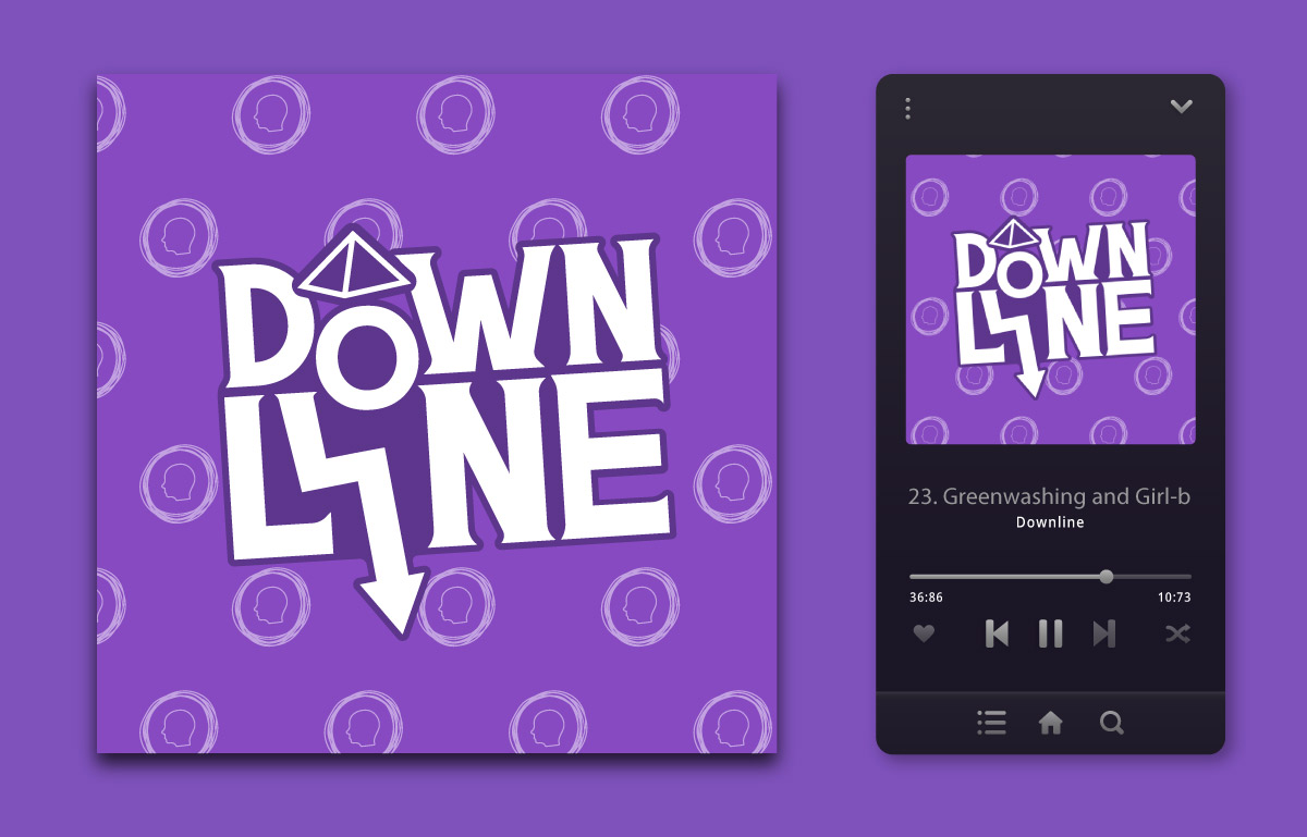
Welcome to Downline, the captivating podcast hosted by Bailey Pelletier. With a sharp focus on consumer awareness, Downline delves deep into the intricate world of Multi-level Marketing (MLM). This thought-provoking podcast goes beyond the surface, unraveling the complexities of the MLM industry while shedding light on the inherent issues within the companies that comprise it.
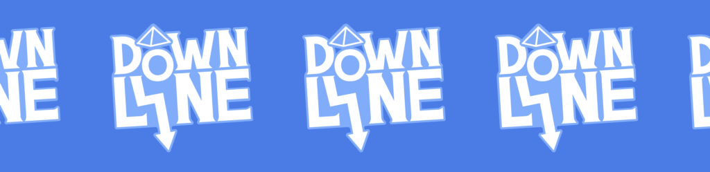
To complement this compelling content, a comprehensive re-branding effort was undertaken, breathing new life into Downline’s visual identity. The rebranding process drew inspiration from the podcast’s previous branding elements, incorporating a captivating palette of purples, greys, and blues. These colors evoke a sense of sophistication, professionalism, and trust, aligning perfectly with Downline’s mission to dissect the MLM industry.
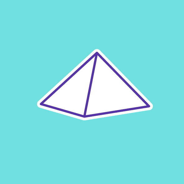
In addition to the visual overhaul, Downline’s rebranding also included the creation of custom icons that capture the essence of the MLM space. These icons serve as visual representations of the podcast’s exploration of MLM-related topics, serving as engaging and recognizable elements throughout Downline’s brand ecosystem.
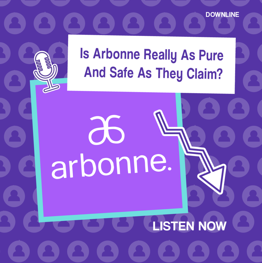
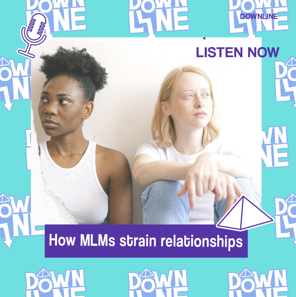
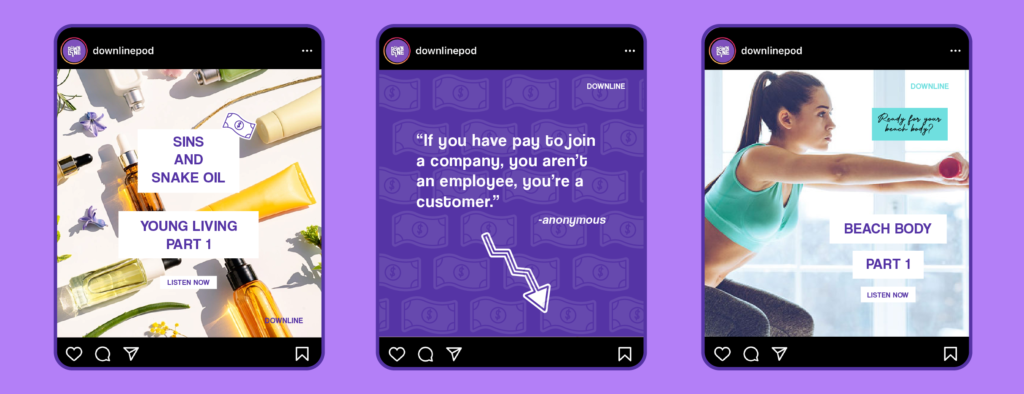
To further enhance the podcast’s online presence and engage with its audience, an array of content and templates were meticulously crafted for social media platforms. These captivating designs not only introduce each podcast episode but also facilitate general discussions on various MLM-related subjects. Through these well-designed and thoughtfully curated social media assets, Downline sparks meaningful conversations and builds a community of individuals seeking a deeper understanding of the MLM industry.
Through these designs, you can join Bailey Pelletier on Downline as she fearlessly dismantles the myths, unveils the pitfalls, and unravels the complexities of Multi-level Marketing. Experience the captivating power of visual storytelling and immerse yourself in a world where design meets social consciousness. Downline is not just a podcast, but a transformative journey through the underbelly of the MLM industry.
In a world where substances like psilocybin mushrooms, marijuana, CBD, and other psychedelic substances are legal, Sensory Psychedelics operates as a company specializing in the sale and distribution of these products. It functions as a dispensary, providing a variety of psychedelic substances to individuals who are interested in exploring their potential benefits.
My role was to create compelling branding, design eye-catching social media graphics, develop captivating product packaging, and design an inviting store front.
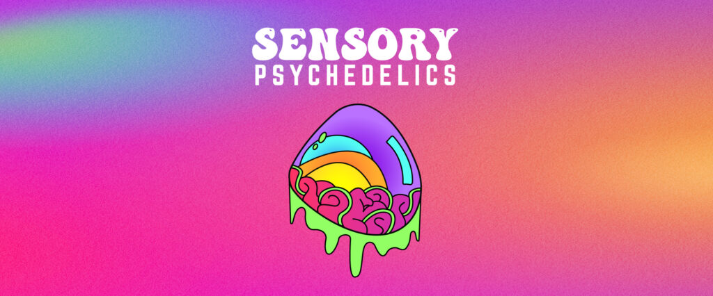
Branding: I crafted a captivating and distinct brand identity. The logo reflects the company’s commitment to exploring consciousness and promoting well-being through psychedelic substances. I carefully selected colours, typography, and imagery that resonate with the target audience, capturing the essence of the psychedelic experience while maintaining a professional and approachable vibe.
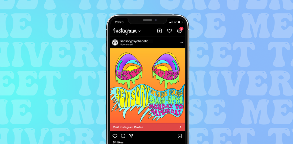
Social Media: I developed visually stunning graphics for Sensory Psychedelics’ social media platforms. These graphics effectively communicated the brand’s message, promoting the positive effects of their products and fostering a sense of community among their followers. I utilized vibrant colors, psychedelic patterns, and engaging visuals to create an immersive and captivating social media presence.
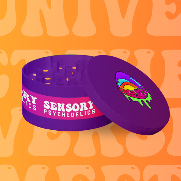
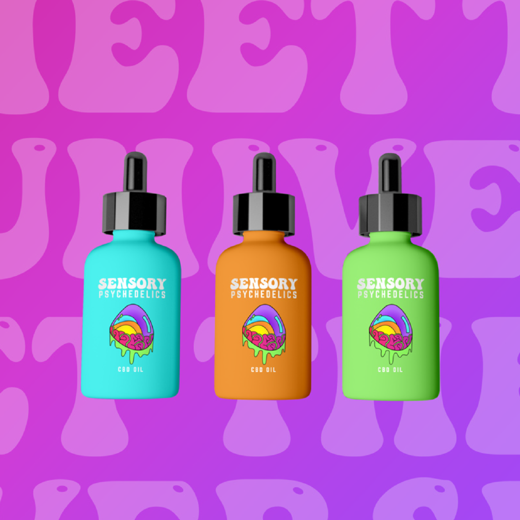
Product Packaging: I designed captivating product packaging that adheres to legal requirements while showcasing the brand’s identity. The packaging is designed to stand out on dispensary shelves, attracting attention and conveying a sense of trust and quality. I incorporated psychedelic motifs, and carefully chosen typography to create a visually striking and informative packaging design.
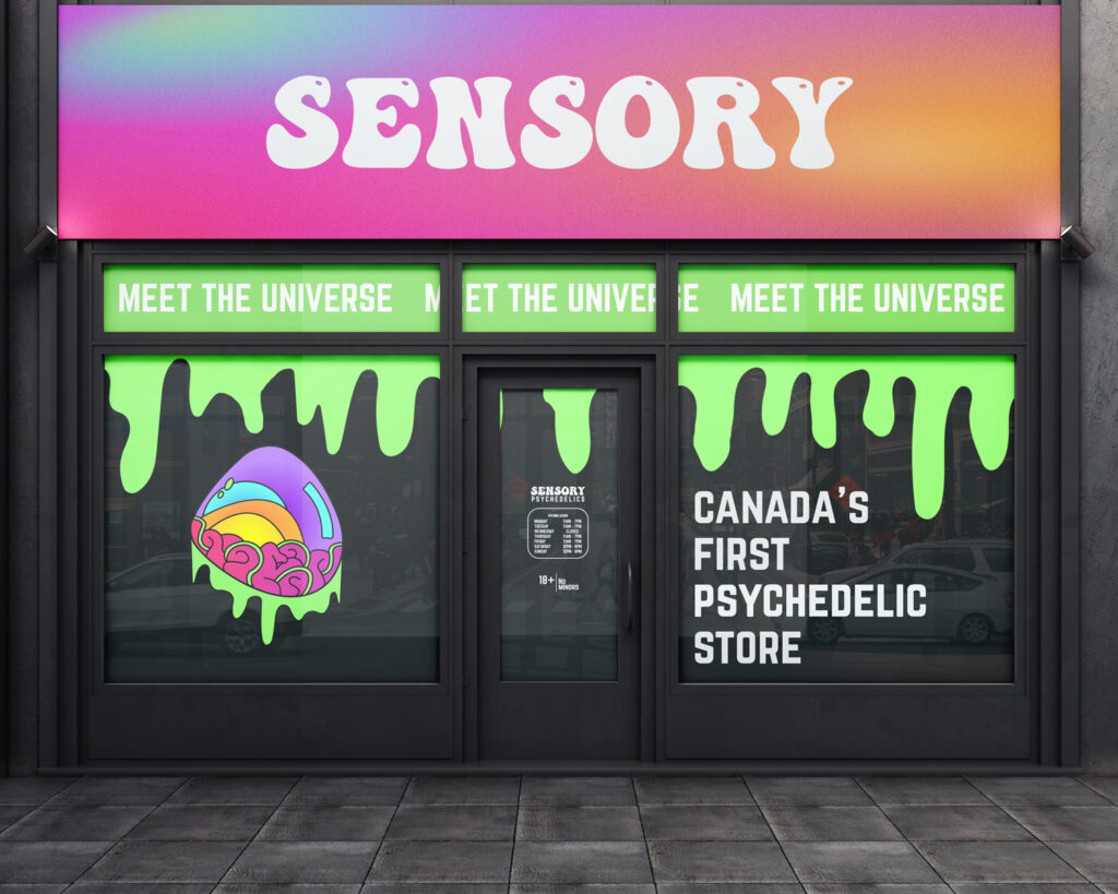
Store Front: For Sensory Psychedelics’ physical location, I created a store front design that captures the essence of the brand, entices customers to step inside, and takes into consideration Canadian regulations. The design features large, illuminated signage that showcases the brand name and logo, making it easily recognizable from a distance. To maintain compliance with Canadian regulations, the windows are covered with custom designs that incorporate psychedelic elements while still maintaining privacy.
Through my communications and graphic design work with Sensory Psychedelics, I successfully brought their brand to life, ensuring consistency across branding, social media graphics, product packaging, and store front design. The result is a visually captivating and cohesive visual identity that resonates with the target audience and sets Sensory Psychedelics apart in the legal psychedelic industry.
Target Audience
Millenials, Gen Z
Services
Branding, Social Media, Product Packaging, Store Front
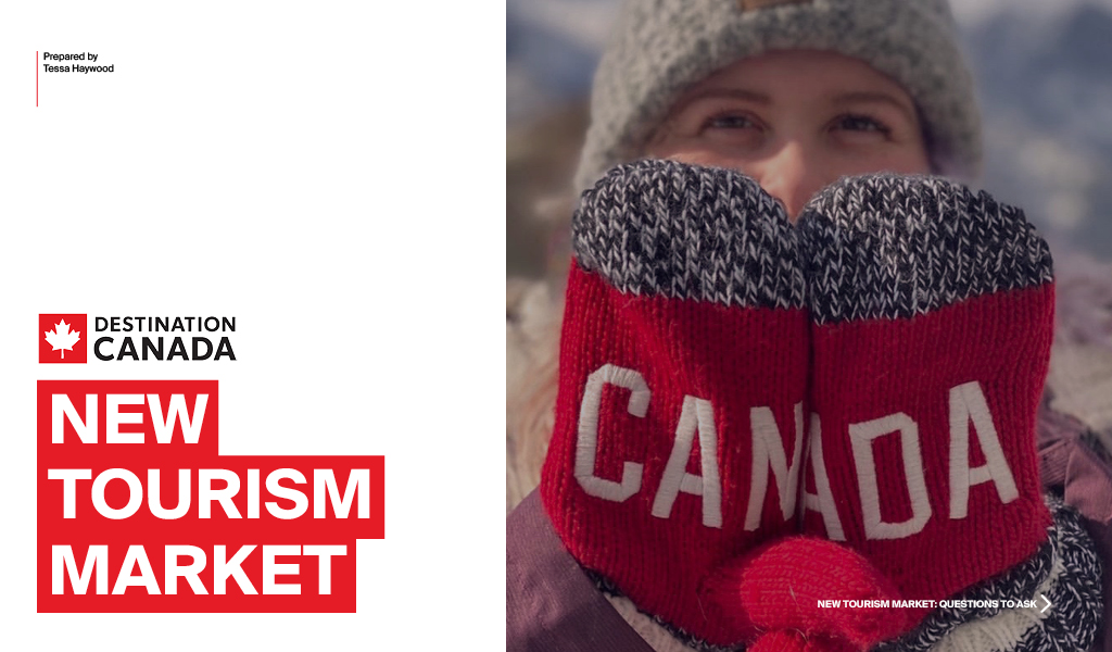
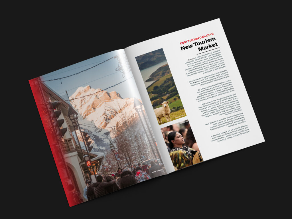
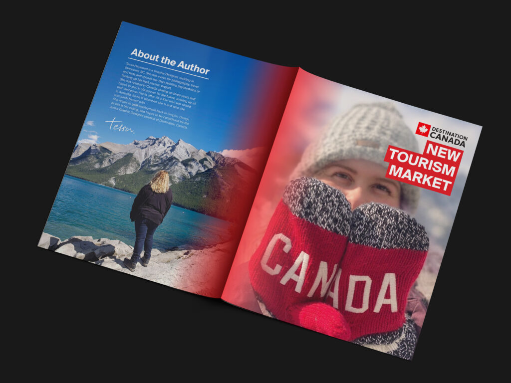
Destination Canada is a federal governmental agency that studies the tourism industry and boosts relationships between countries such as Germany, Australia, South Korea and the UK. The agency studies the tourism within Canada and inbound tourism.
As per Destination Canada’s website “Destination Canada provides intelligence, tools and resources that help the Canadian tourism industry reach domestic and international markets.” Destination Canada believes in the power of tourism and I do too!
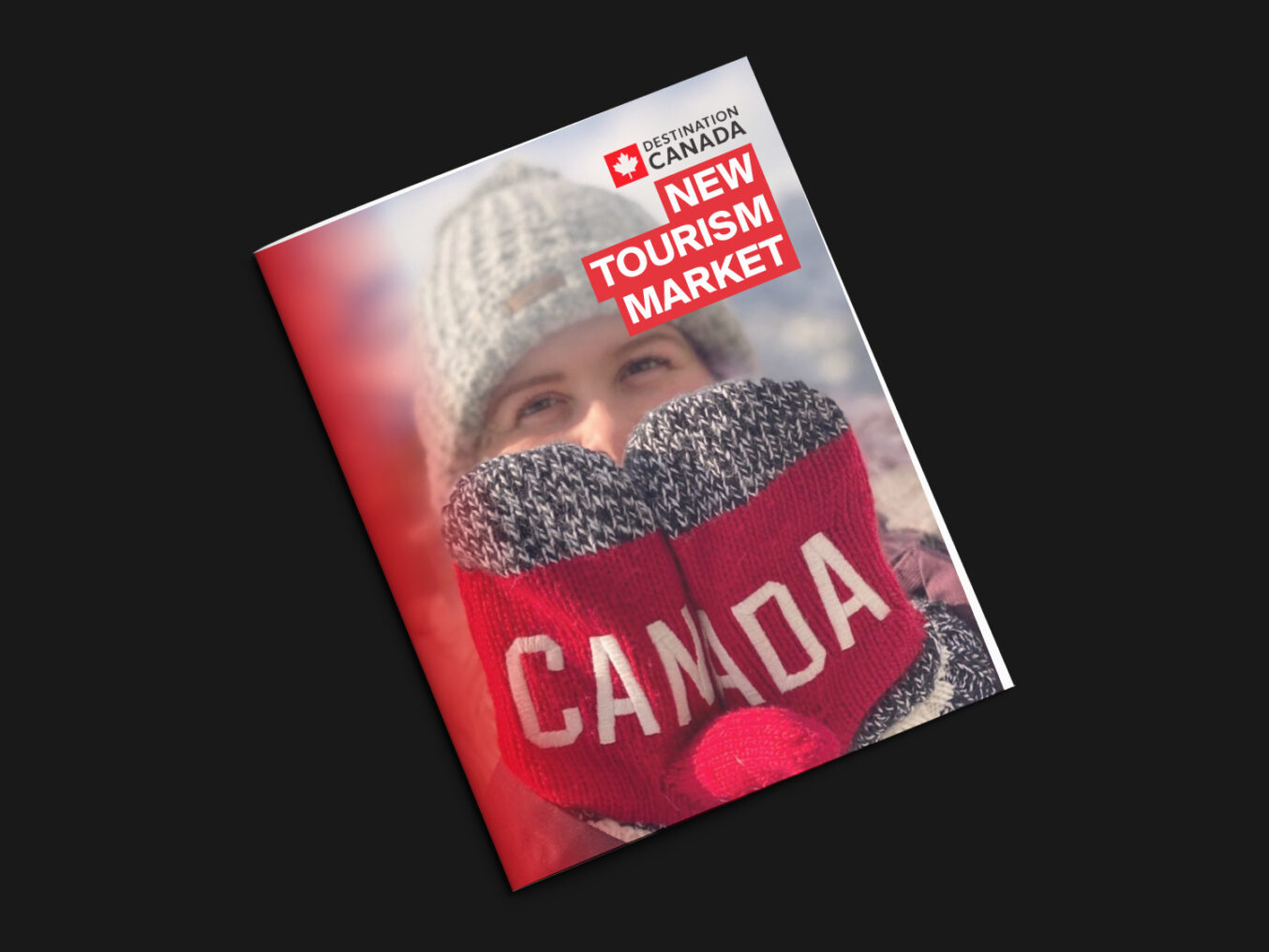
My idea for this project was to create something for a destination that may not have been explored before and this is New Zealand. As I am a proud Kiwi, and Destination Canada does not currently research the inbound tourism from New Zealand, I wanted to create a booklet and presentation on reasons why Destination Canada should consider New Zealand for market research.
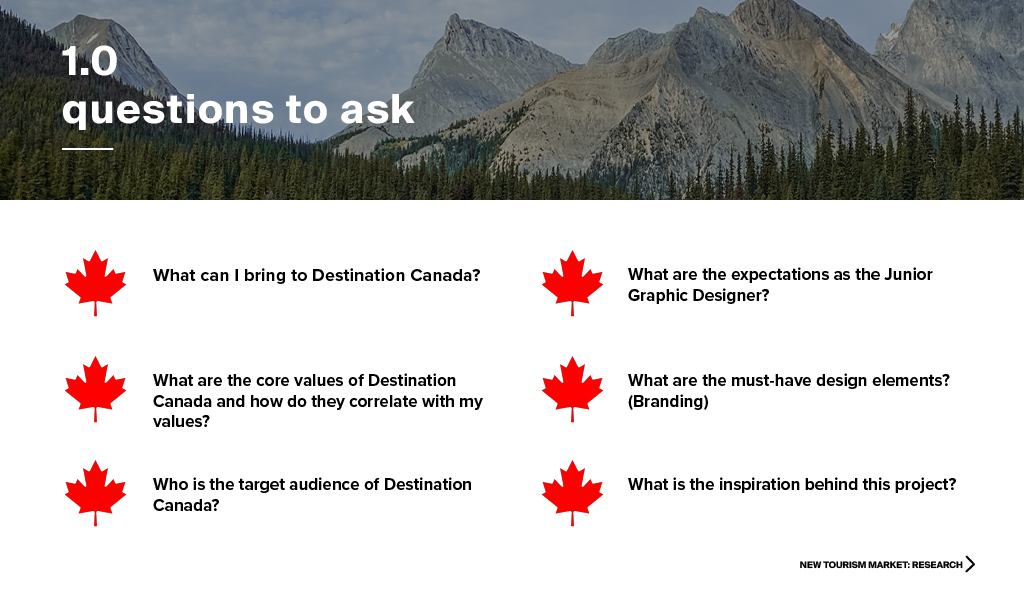
The key questions I asked in the research and brainstorming stage were:
What can I bring to Destination Canada?
What are the core values of Destination Canada and how do they correlate with my values?
Who is the target audience of Destination Canada?
What are the expectations as the Junior Graphic Designer?
What are the must-have design elements? (Branding)
What is the inspiration behind this project?
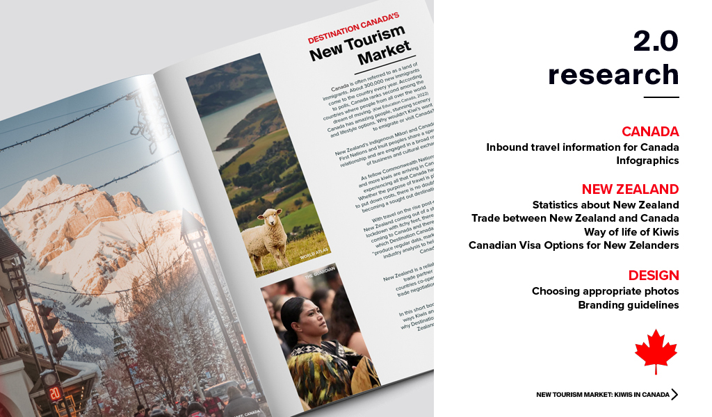
Through consideration for this questions and thorough research, I was able to create 6 spreads (including front and back) and a presentation using photos that I have taken myself in my travels around Canada and photos found online (for the New Zealand portion).
I used the Brand Identity from the Destination Canada website here. I wanted to make sure, as this would be considered a corporate communication piece, I would use the Corporate Destination Canada logo and not the logo used for Marketing Communications. I did use the logo for Marketing Communications at the end of the booklet for the physical version. I made sure to use the right brand colours – Red, Green and Black along with other accent colours (Yellow, Lilac, Brown etc.) I also wanted to put a spin in these branding guidelines and show my style and my skills.
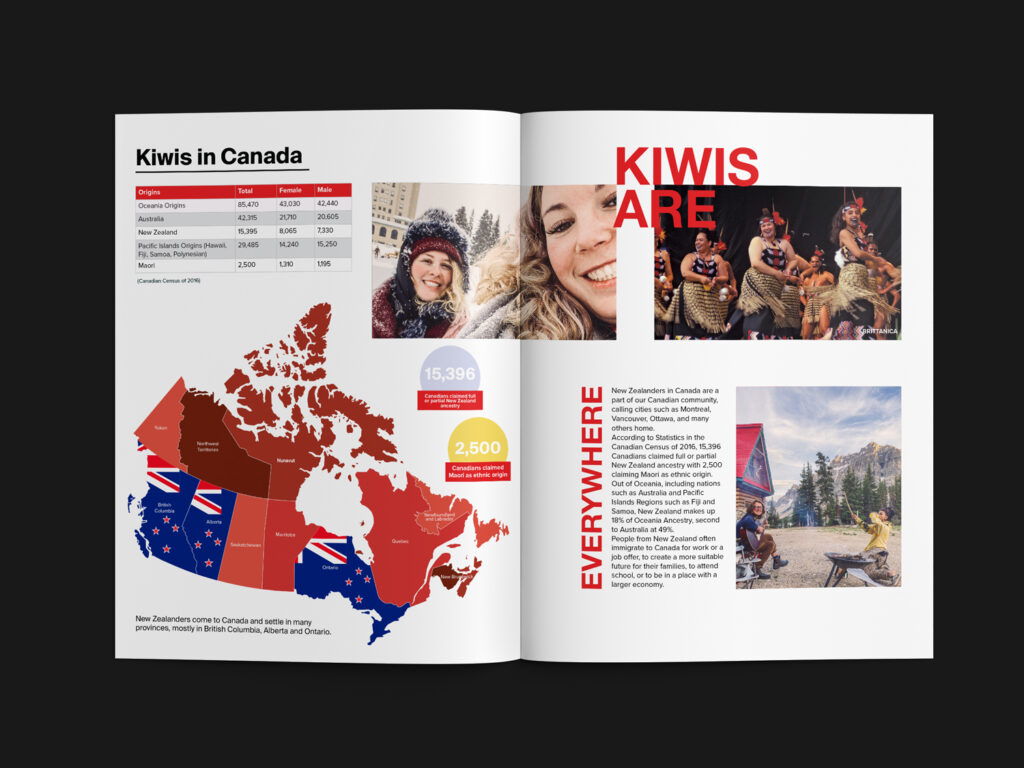
Banff is pictured on the left, with photos of the New Zealand hills and a Maori woman on the right. This page is an introduction for the booklet.
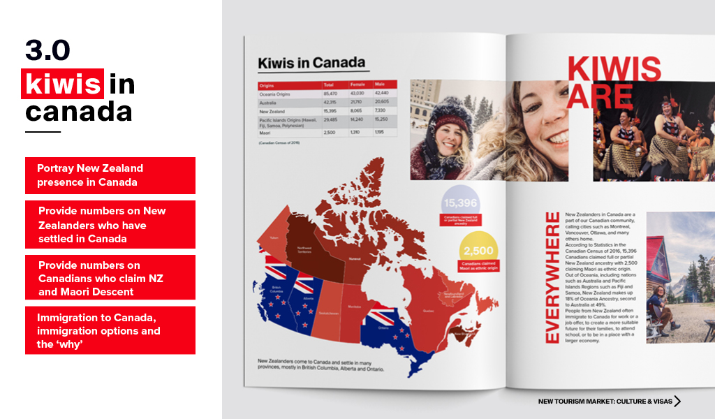
Left is a diagram of Canada illustrating the most sought out regions of Canada in which NZers wish to settle using an NZ flag. Above is a table of statistics showing how many people claimed Oceania ancestry. On the right are photos of Bow Lake, Maori women dancing and a photo of myself and my friend Zoe, who is also a Kiwi.
With the “Kiwis in Canada” spread I wanted to show some statistics of how many Canadians claimed New Zealand ancestry. Finding these sort of statistics was quite difficult and I was able to get the data from an archive of the Canadian Census of 2016. There is a similar example of the use of white space within the branding guidelines of Destination Canada and I wanted to illustrate I can adapt to different branding guidelines.
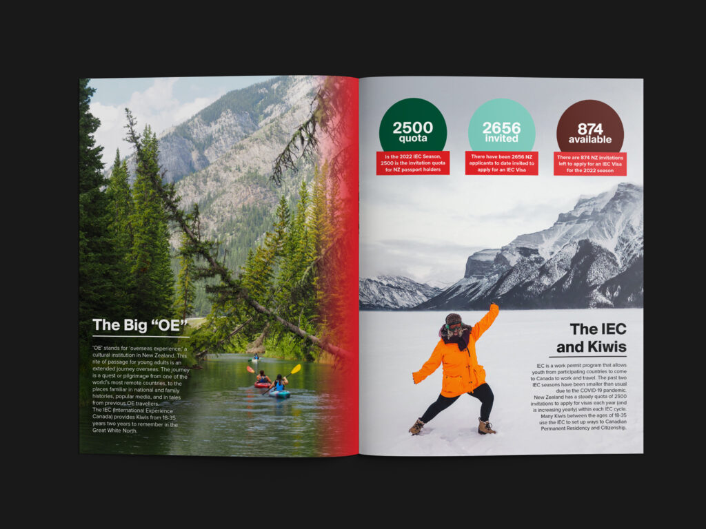
The photo on the left is from the Fenland Trail in Banff, AB and the right photo is taken of myself at Lake Minnewaka, AB.
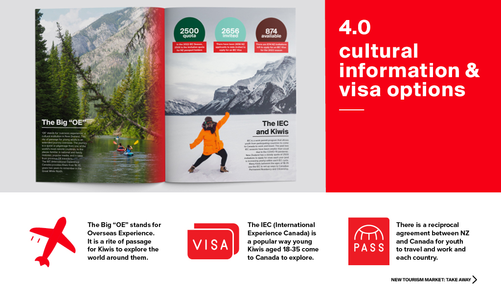
Ever since I was younger, I heard my mother talking about the big “OE”. This is called an “Overseas Experience” and is a rite of passage for so many young New Zealanders. We set off and call another part of the world home from days to weeks and it gives young people the chance to experience the world and challenge their beliefs by meeting so many different people. The IEC is a way these Kiwis gain access to the wonders of Canada.
I wanted to illustrate a cultural significance for New Zealanders and why young Kiwis go overseas. I also wanted to illustrate a popular visa option.
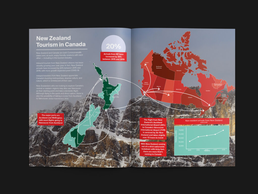
Getting down to the nitty-gritty of statistics, I wanted to illustrate the ports where New Zealanders are most likely to leave New Zealand and arrive in Canada. Most New Zealanders arrive in Vancouver and make their way to other parts of Canada. I included a graph showing the non-resident arrivals from New Zealand for the years 2015-2019. I couldn’t find any recent statistics as there was the pandemic in 2020 and 2021 may still be currently studied. Behind is a photo of Castle Mountain in Alberta.
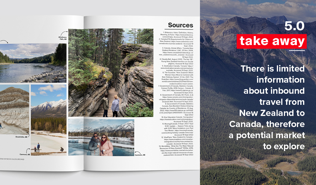
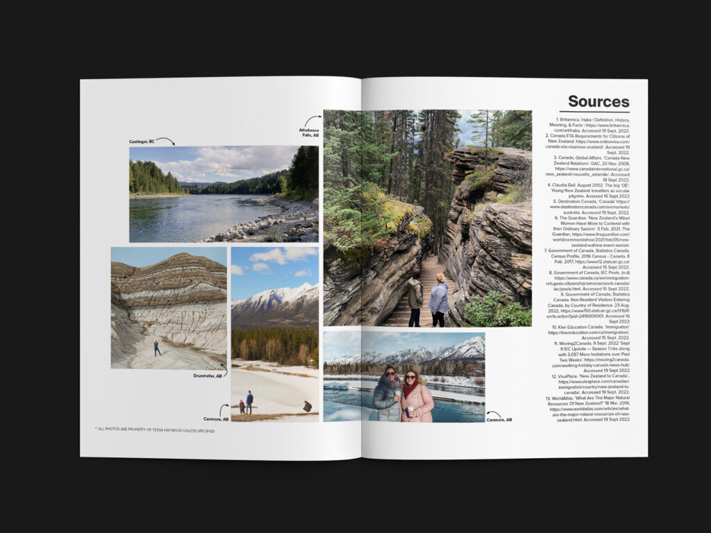
I wanted to include the resources used in this project as it was very research intensive. To make it less boring, I included other photos from my travels around Canada.
This was a very fun project! I learnt a lot more about New Zealand and learnt that there really isn’t a whole lot of information about the tourism ties between New Zealand and Canada. As we are both Commonwealth Countries and the trade, political and cultural ties are very tight, Destination Canada should use this opportunity to consider New Zealand as a viable Tourism Market for research to grow the Canadian tourism industry.
There is limited information about inbound travel from New Zealand to Canada, therefore a potential market to explore at Destination Canada.
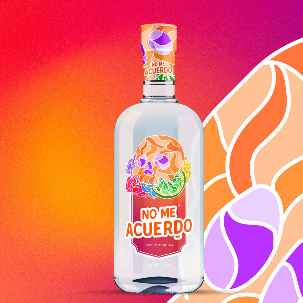
A tequila brand targeting 20-35-year-olds who enjoy a good time!
Drinking alcohol has long been associated with social events, hanging out with friends and parties; of course. But did you know that the logo design and packaging design chosen by an alcohol brand can determine who chooses to drink it?
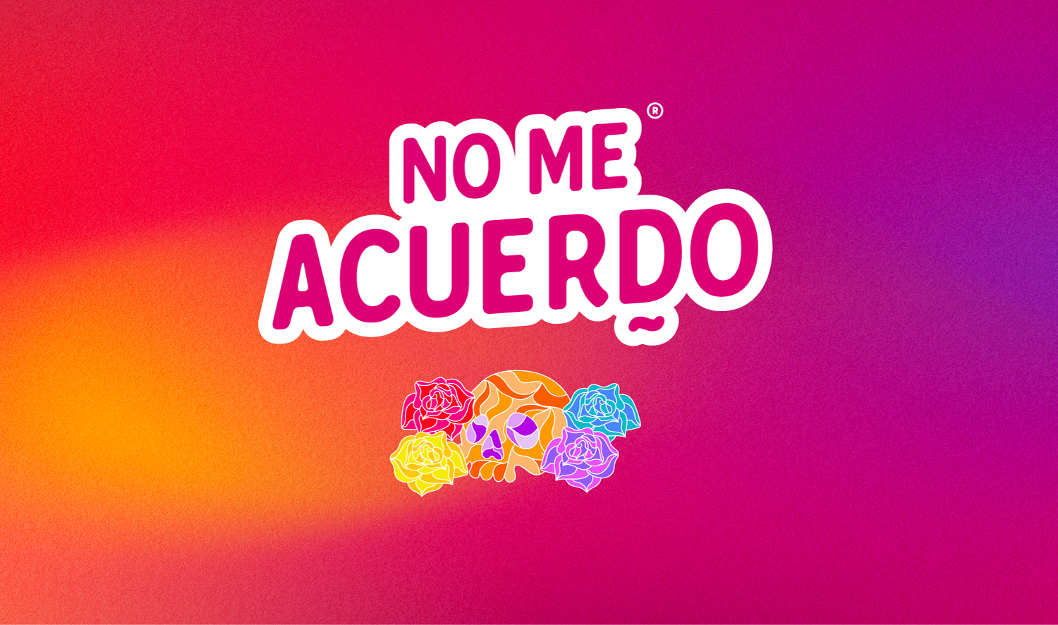
This wacky and fun tequila brand, No Me Acuerdo, or ‘I don’t remember’ was all about creating good times and helping people form lifelong memories with their friends; even those memories that are somewhat foggy. Just one shot or mixed drink with this powerful tequila can transform a mellow party into a good time. But when I first laid eyes on the brand, it seemed to be missing something. The branding and ideas were great, but the visuals targeted the wrong customers.
NSo, I quickly partnered with my design buddy, Amanda Harbrow, to change this branding package for the better – Check out her amazing work Harbow Creations.
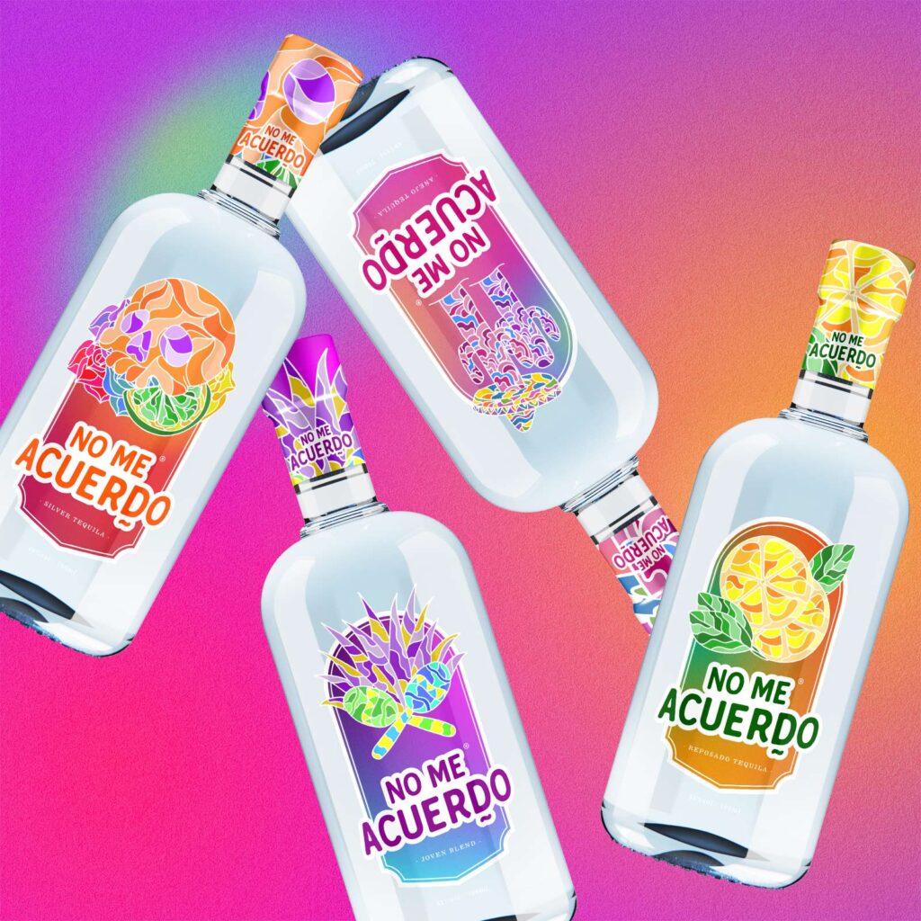
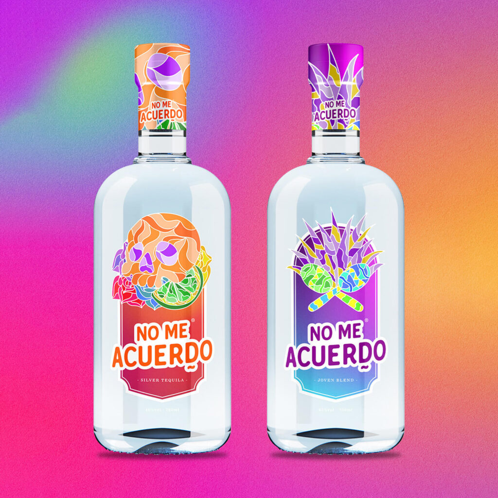
Targeting males and females from 20-35 years old, when creating the logo and package design for No Me Acuerdo, I knew we needed something that was both fun and sophisticated. After all, many of these target drinkers had tried tequila before, but not the authentic kind No Me Acuerdo produces. We needed a branding design that showed how they were different while appealing to their traditional Mexican heritage.
Rather than sticking with the overused red tones; so often associated with Americanised Mexican culture, we took a different route.
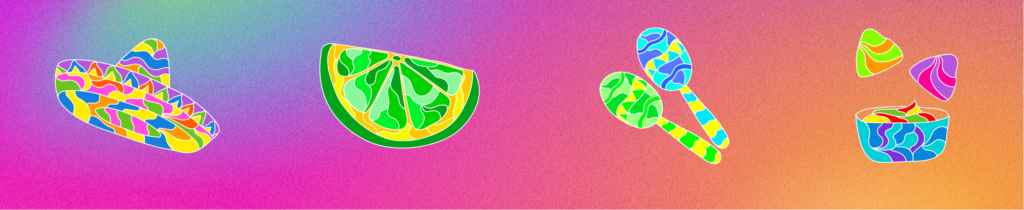
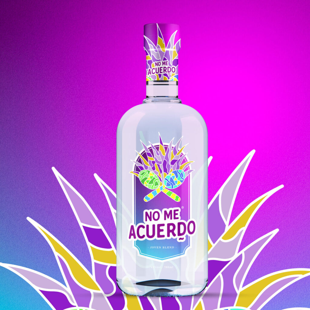
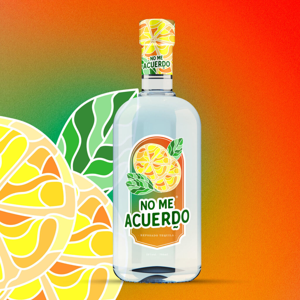
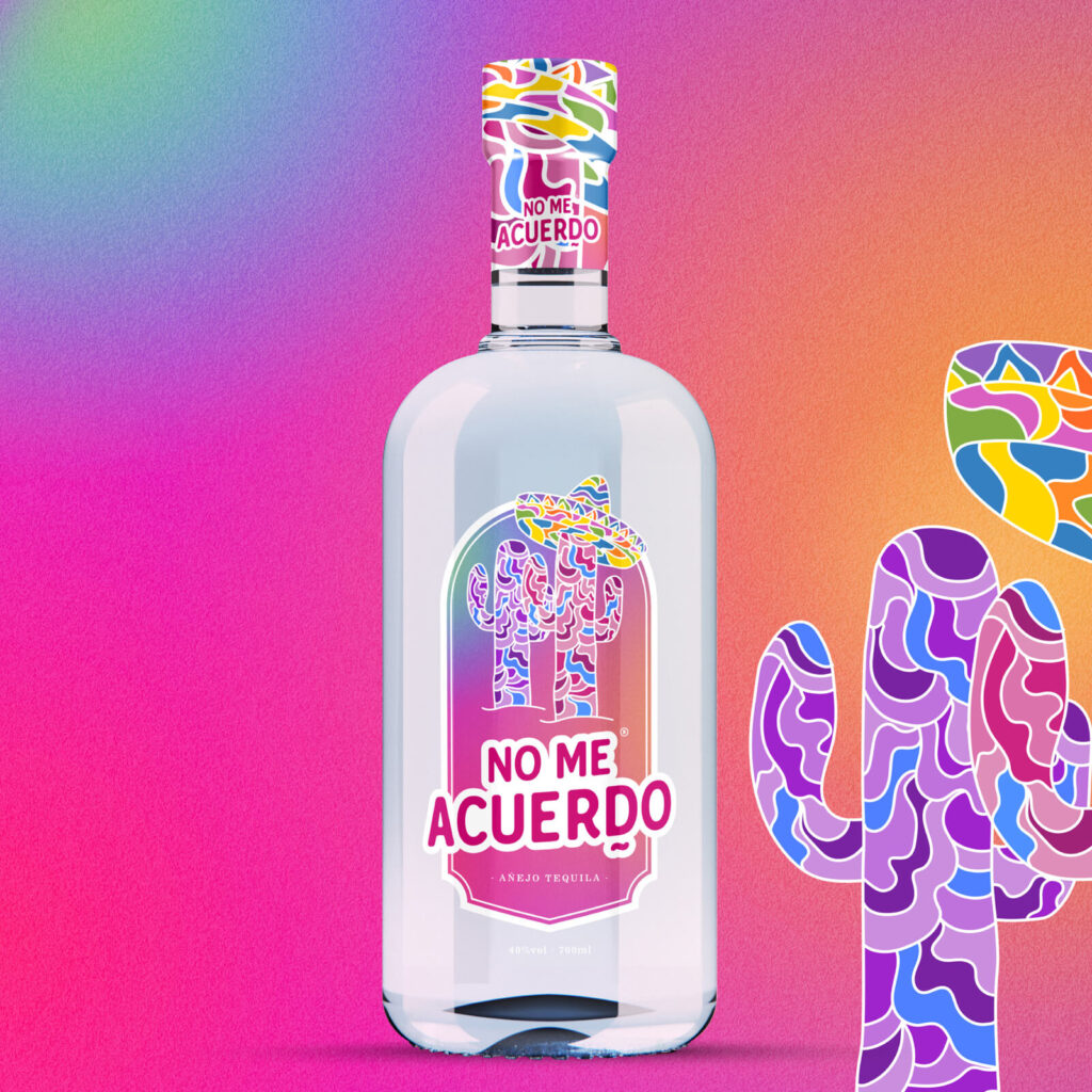
When designing this package, we focused heavily on Mexican celebrations, particularly Cinco De Mayo and the Day of the Dead. This allowed us to really navigate traditional imagery without needing excessive sombreros and tacos.
Through careful research, Amanda and I took some of the most recognised Mexican symbols and incorporate them into detailed product packaging designs. We merged our graphic design skills to create a colourful, powerful and eye-catching design that could stand out on the shelves.
We created four tequila labels in total. The elements we chose included traditional Mexican Skulls, Cacti, Lemon and Lime, and Maracas. We used colour-blocking techniques in a mosaic-style design to guarantee that the product would make an impact, especially when on the shelves next to other tequila products.
This colour blocking created a sense of character but allowed the product to be positioned on the shelves as affordable. This is an essential factor for most 20-35-year-olds when purchasing alcohol, especially from a brand they haven’t tried in the past. As the colours were all those which are usually associated with Mexican events, this graphic design also looked much more authentic on the shelves. It instantly gave off the energy that one sip could transport someone to Mexico.
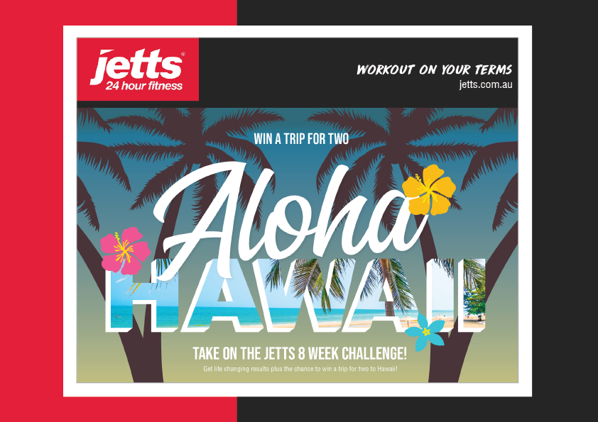
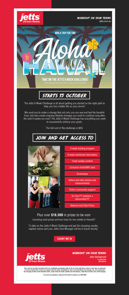
Here is an email blast designed exclusively for Jetts Australia’s thrilling 8-week challenge marketing campaign. The primary objective was to entice individuals to join the challenge, with an enticing top prize—a dream trip for two to the enchanting paradise of Hawaii.
To capture the essence of this captivating campaign, I employed a palette inspired by breathtaking sunsets—warm, vibrant hues that immediately transport the viewer to a tropical oasis. I adorned the top of the design with swaying palm trees and vibrant Hawaiian flowers, infusing a sense of allure and wanderlust. This visual approach aimed to captivate the audience’s attention and evoke a desire to embark on a journey of transformation.
Jetts’ branding primarily embraces the energetic colours of red, black, and white and I strategically these elements throughout the layout to maintain brand consistency and reinforce the gym’s identity. The red evokes a sense of dynamism and determination, symbolising the commitment to long-term change within the challenge. Black brings sophistication and strength, highlighting the seriousness of the endeavour, while white represents purity and clarity, reminding participants of the ultimate goal—improved health and well-being.
To convey the nature of the 8-week challenge, I carefully selected photographs showcasing both personal training and nutrition. These images aimed to inspire and educate, visually reinforcing the importance of exercise and healthy eating habits. By merging captivating visuals with informative content, the design effectively communicates the campaign’s underlying message: empowering the community to embrace positive lifestyle changes and prioritise their well-being.
With this email blast, my goal was to create a captivating composition that not only reflects Jetts Australia’s branding but also ignites excitement, encourages participation, and fosters a sense of community.
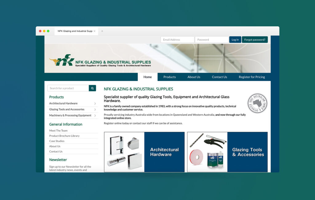
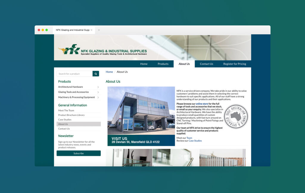
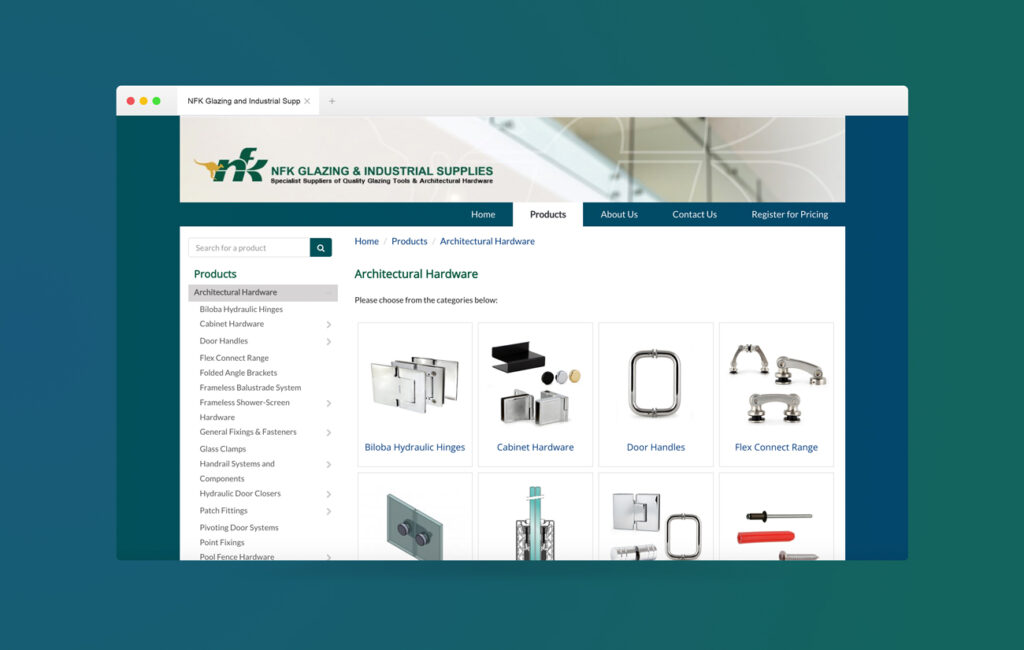
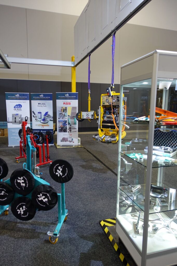
NFK is a specialist supplier of quality Glazing Tools, Equipment, and Architectural Glass Hardware, serving builders, glazers, and professionals in the construction industry throughout Australia. Established in 1983 as a family-owned company, NFK has built a strong reputation based on innovative quality products, technical knowledge, and excellent customer service.
Recognising the importance of embracing technology to drive sales, myself, along with the owner of NFK embarked on a website design project. The goal was to create a modern and functional website that would cater specifically to their target audience. Working closely with the owner, the website was carefully crafted to showcase NFK’s extensive range of products. High-quality photographs were taken and expertly edited to accurately represent the tools, equipment, and glass hardware offered by NFK. In collaboration with the owner, compelling copy was developed to effectively communicate the features, benefits, and value proposition of each product.
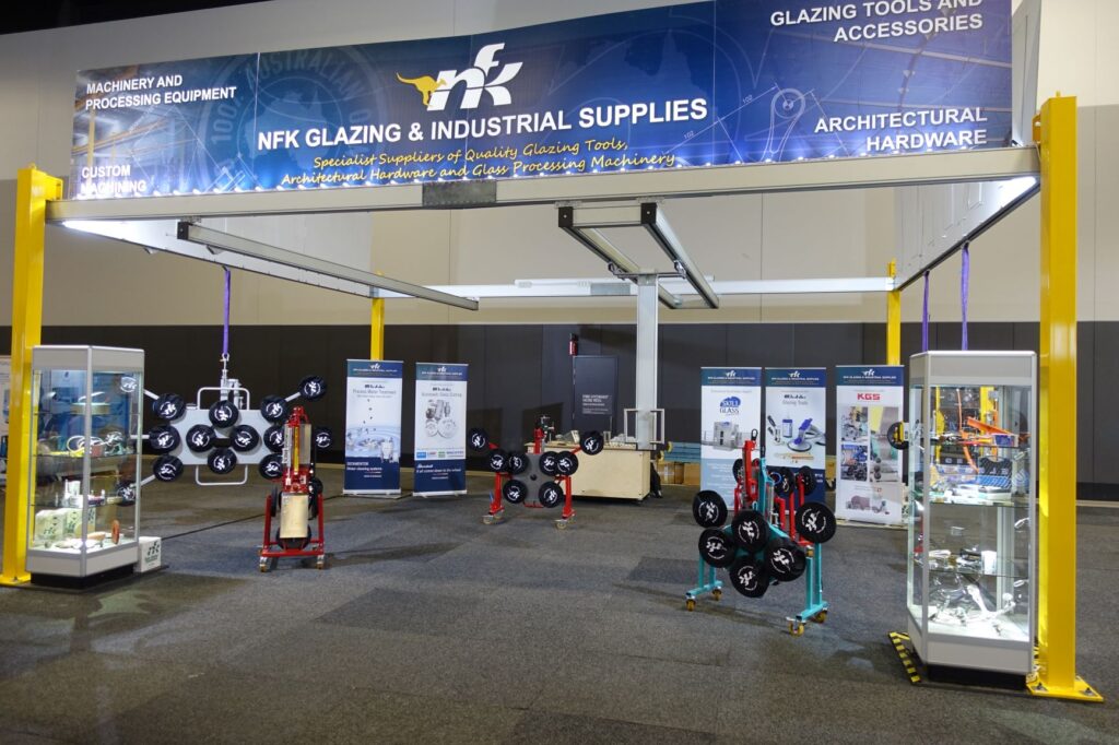
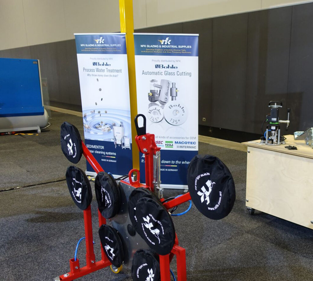
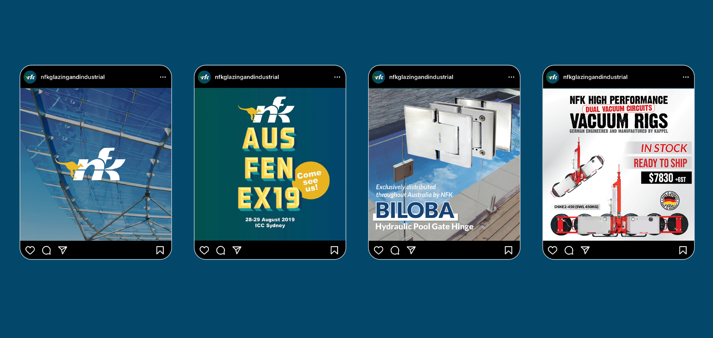
In addition to the online presence, NFK actively participated in industry events such as the AusFenEx Conference and Exhibition 2019. To maximize their visibility and convey their brand message, I designed captivating signage and informative banners for the event. The primary signage, created on a large scale, successfully highlighted NFK’s commitment to delivering top-quality solutions and garnered attention from builders, glazers, and professionals attending the conference.
To further expand their reach and engage with their target audience, we implemented a comprehensive marketing strategy encompassing email campaigns and social media. Email marketing campaigns were developed to provide valuable industry insights, showcase new product releases, and offer exclusive promotions tailored to the needs of builders, glazers, and professionals in the construction industry. These campaigns were complemented by strategic and targeted social media posts, enabling NFK to effectively communicate their value proposition and build brand awareness among their target audience.
NFK’s brand presence and marketing collateral demonstrates their expertise to builders, glazers, and professionals in the construction industry. Through the development of a visually appealing and user-friendly website, the creation of impactful signage for industry events, and the implementation of comprehensive email marketing and social media strategies, NFK now showcases their commitment to excellence in selling business-to-business within the construction industry throughout Australia and worldwide.
Services
Web Design, Product Photography, Signage, Social Media
This project involved creating visually striking and informative signage to promote NFK Glazing and Industrial Supplies at the expo. Here’s an overview of my approach and the elements I incorporated:
Brand Integration: I ensured that the signage aligned with NFK’s brand identity, incorporating their logo, colours, and typography. This helped maintain consistency and reinforce brand recognition among expo attendees.
Eye-catching Design: Given the competitive nature of expos, I focused on creating signage that would capture attention and stand out amidst the crowd. I utilised bold colours, captivating visuals, and engaging graphics to make the signage visually appealing and impactful.
Product Showcase: To showcase NFK’s glazing tools and supplies effectively, I incorporated high-quality images or illustrations of their flagship products such as a Water Treatment Machine and Automatic Glass Cutting on the signage. This helped potential customers visualise the value and quality of NFK’s offerings.
Social Media and Email Marketing
I had the pleasure of working with Hayden from NFK Glazing and Industrial Supplies to create captivating email campaigns and engaging social media posts.
Instagram and Facebook: Recognizing the visual nature of the glazing and construction industries, I strategically utilized Instagram and Facebook to engage NFK’s target audience. Here’s a glimpse into my approach:
Visual Storytelling: I curated visually compelling graphics and images that tell the story of NFK’s products in action. By showcasing the tools within real-world scenarios, I effectively captured the attention of the audience as they scroll through their social media feeds.
Brand Identity: I ensured consistency in visual elements, such as color palette, typography, and overall style, to reinforce NFK’s brand identity across their social media presence. This helps in creating a cohesive and recognizable visual representation of the company.
Eye-catching Graphics: I designed captivating graphics that convey the key features and benefits of NFK’s glazing tools and supplies. These graphics not only capture attention but also communicate the value proposition of the products, making them more enticing to the audience.
Customer Testimonials: Harnessing the power of social proof, I created visually appealing graphics featuring testimonials from satisfied NFK customers. These testimonials highlight the exceptional quality and performance of NFK’s products, fostering trust and confidence among potential customers.
Call-to-Action: Each social media post includes a clear and compelling call-to-action, directing the audience to take the desired action—whether it’s visiting NFK’s website, exploring a specific product range, or contacting their sales team for inquiries. The call-to-action elements are designed to be visually prominent and easily recognizable.
By employing these strategies, I aimed to create visually captivating social media content that resonates with NFK’s target audience, increases engagement, and drives conversions.
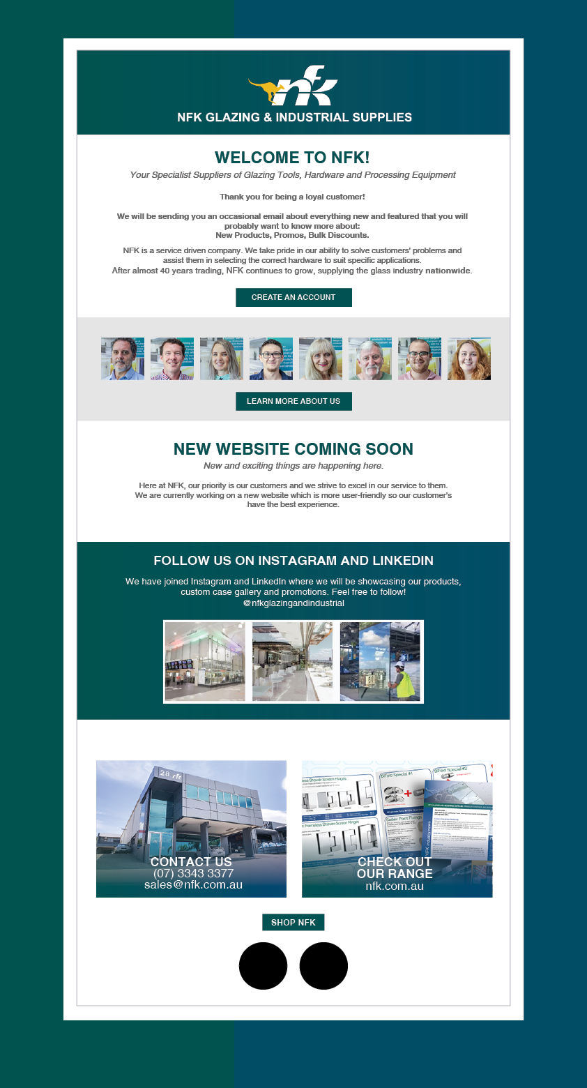
For the welcome email sent to all customers, the objective was to create a warm and inviting message that establishes a positive connection with the recipients. The email design featured a visually appealing layout, incorporating NFK’s branding elements such as the logo, colour palette, and typography.
The content of the welcome email aimed to provide a brief introduction to NFK Glazing and Industrial Supplies, emphasising their expertise in supplying top-quality tools and supplies to the glass and construction industries. The email also highlighted the benefits of being a customer, such as access to exclusive offers, promotions, and expert tips. Clear and concise calls-to-action encouraged recipients to explore the website, follow NFK on social media, and subscribe to their newsletter for future updates.
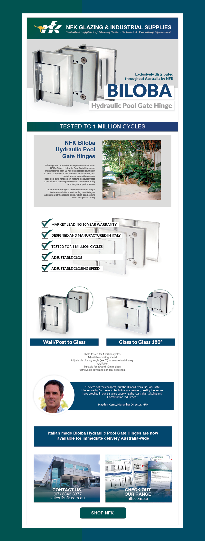
Biloba Hydraulic Pool Hinges – Wall to Glass and Glass to Glass: For the email layout specifically targeting the Biloba hydraulic pool hinges – wall to glass and glass to glass, the goal was to showcase the elegance, functionality, and versatility of these products. The design incorporated high-resolution images of the hinges in various poolside settings, emphasising their seamless integration with glass panels and architectural surroundings.
The layout featured a clean and modern design, allowing the hinges to take center stage. Engaging copy accompanied the visuals, describing the key features and benefits of the Biloba hydraulic pool hinges, such as their smooth operation, durability, and ability to create stunning glass-to-glass and wall-to-glass configurations. The email also included a clear call-to-action, directing recipients to explore the product details on NFK’s website, where they could find more information and make a purchase.
By combining visually appealing designs, persuasive copy, and effective calls-to-action, these campaigns aimed to engage customers, generate interest in NFK’s products, and ultimately drive conversions and sales. All email campaigns were made in MailChimp.
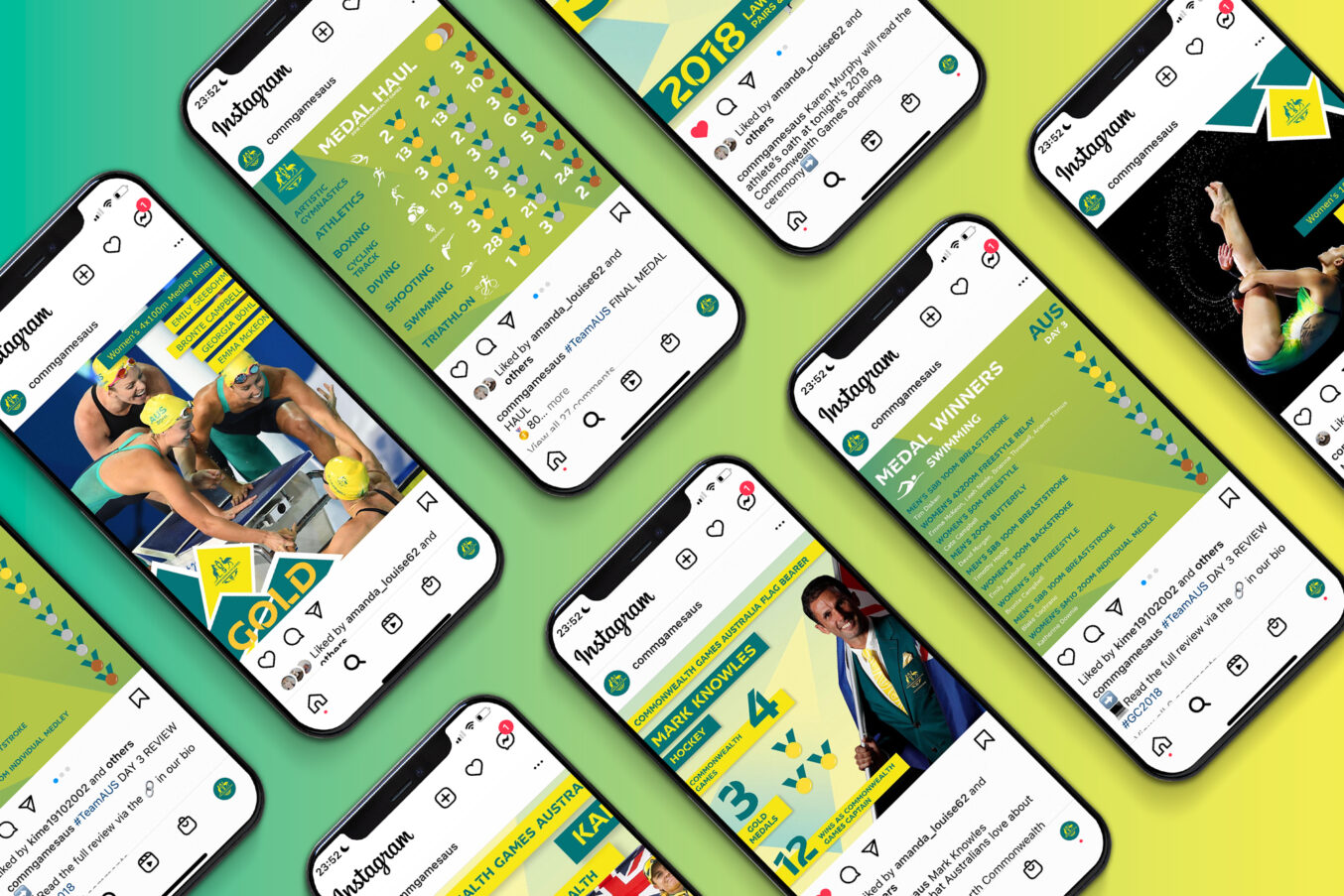
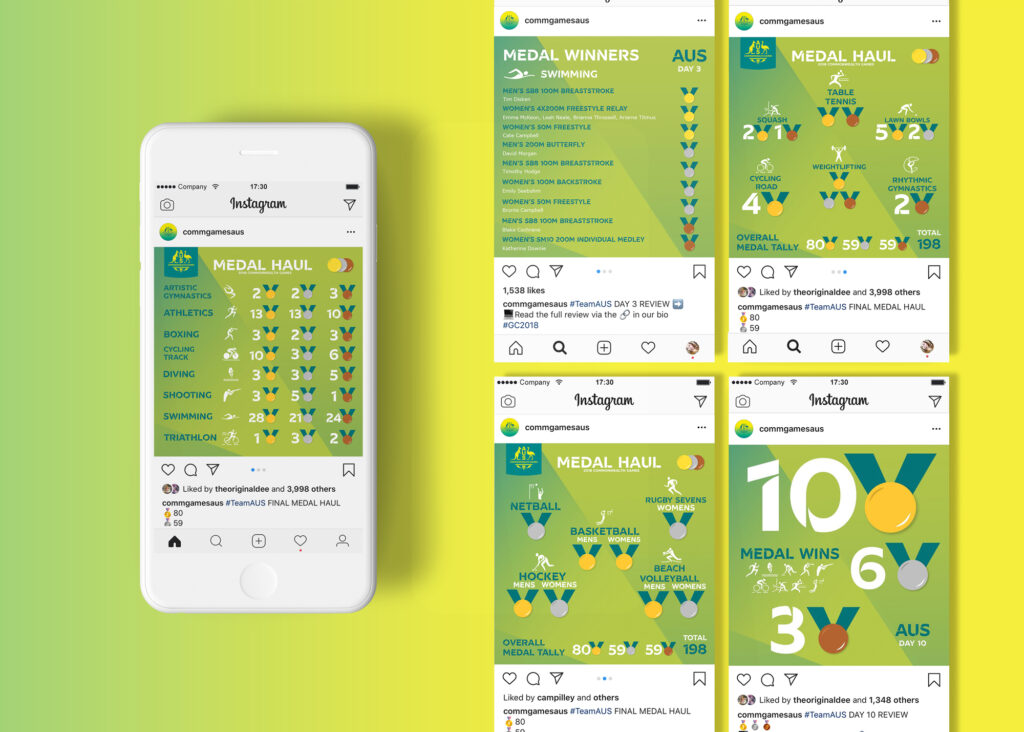
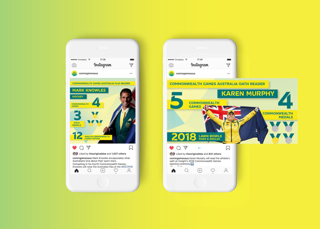
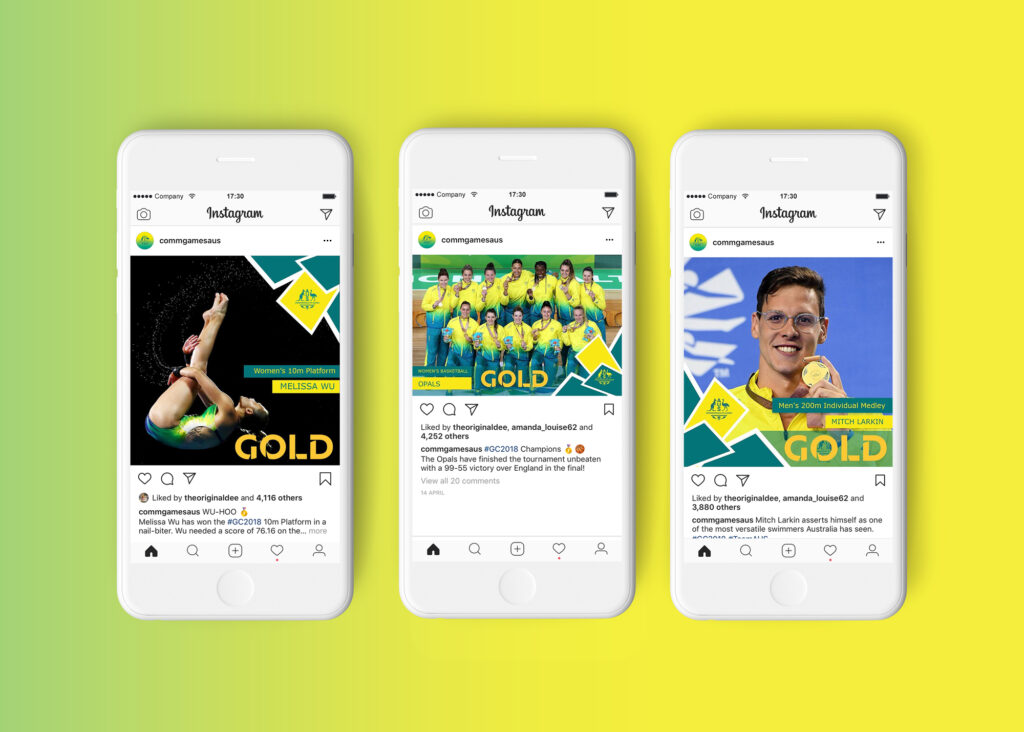
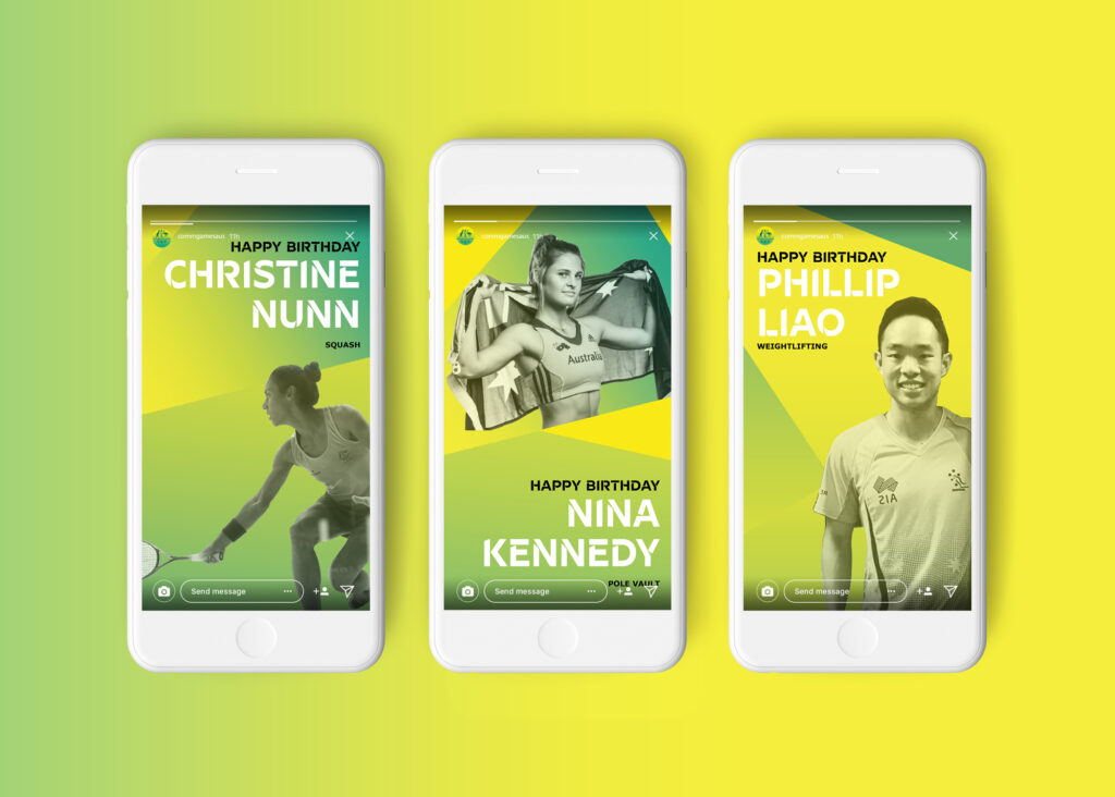
The 21st Commonwealth Games were held on Queensland’s Gold Coast from April 4th to 15th, 2018. This marked the fifth time that Australia had hosted the Games, and it was a significant event for both the athletes and the host country. As part of the preparations and coverage of the Games, the Australian Team recognized the importance of social media in reaching and engaging with a wider audience.
To ensure a cohesive and recognizable brand identity, social media assets were created specifically for the Commonwealth Games Australia team. These assets included various types of content, such as medal tallies, infographics featuring facts about Commonwealth athletes, and Instagram stories highlighting the birthdays of players. The design and content of these assets were consistent with the overall branding elements and colors associated with the Commonwealth Games Australia.
Instagram was one of the primary platforms used to share these social media assets. Instagram allows for visually appealing and easily digestible content, making it an ideal platform for showcasing medal tallies, infographics, and other visually-oriented content. By leveraging the reach and popularity of Instagram, the Australian Team could effectively communicate important information and engage with their audience during the Games.
By utilizing social media platforms like Instagram and Facebook, the Australian Team could amplify the coverage and visibility of the Commonwealth Games, reaching a broader audience beyond the spectators physically present at the event. These social media assets allowed the team to provide updates, share interesting facts, celebrate athletes’ achievements, and engage with fans and supporters in real-time, enhancing the overall experience and sense of connection with the Games.
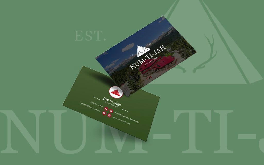
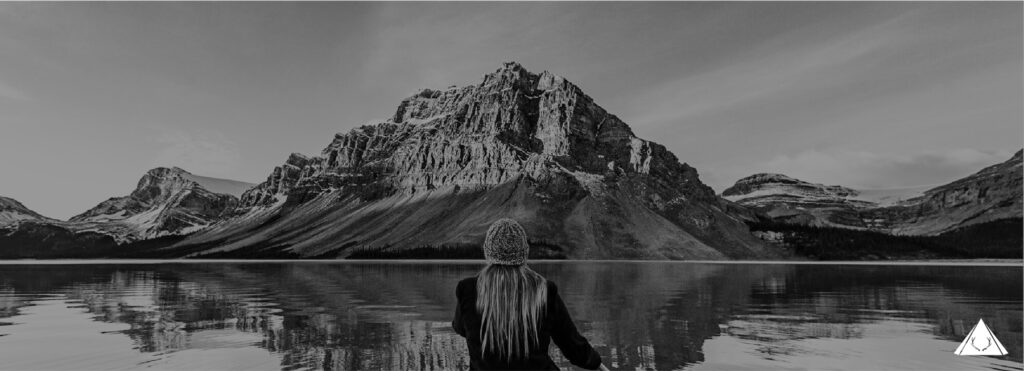
Num-Ti-Jah is a lodge situated in Banff National Park, Alberta, Canada, along the Icefield’s Parkway. It is located approximately 40 kilometers north of Lake Louise on Highway 93. The lodge offers stunning views of the surrounding Canadian Rockies and is positioned overlooking a particularly dramatic scene. When gazing out from Num-Ti-Jah, visitors can admire the majestic mountains that rise steeply and ruggedly beyond Bow Lake. One of the highlights is the sight of the Crowfoot Glacier, where blue ice formations hang suspended over the vibrant turquoise waters of the lake.
The lodge itself consists of various facilities to accommodate guests and enhance their overall experience. It features 16 guest rooms, which provide comfortable accommodations for visitors. These rooms are designed to offer a cozy and relaxing atmosphere, allowing guests to unwind and enjoy their stay in the picturesque setting.
With the desire to enhance the lodge’s ambiance and create a more elegant style, the owner and myself embarked on a redesign project. This endeavour aimed to elevate the lodge’s overall aesthetic appeal and create a refined atmosphere that complements the natural beauty of the surroundings. Through careful consideration of design elements such as colour, typography and social media, the lodge underwent a transformation to provide guests with a sophisticated and memorable experience that matches the breathtaking scenery outside.
Client
Num-Ti-Jah Lodge
Services
Re-branding, Website Design, Hotel Merchandise, Brochure Design, Social Media
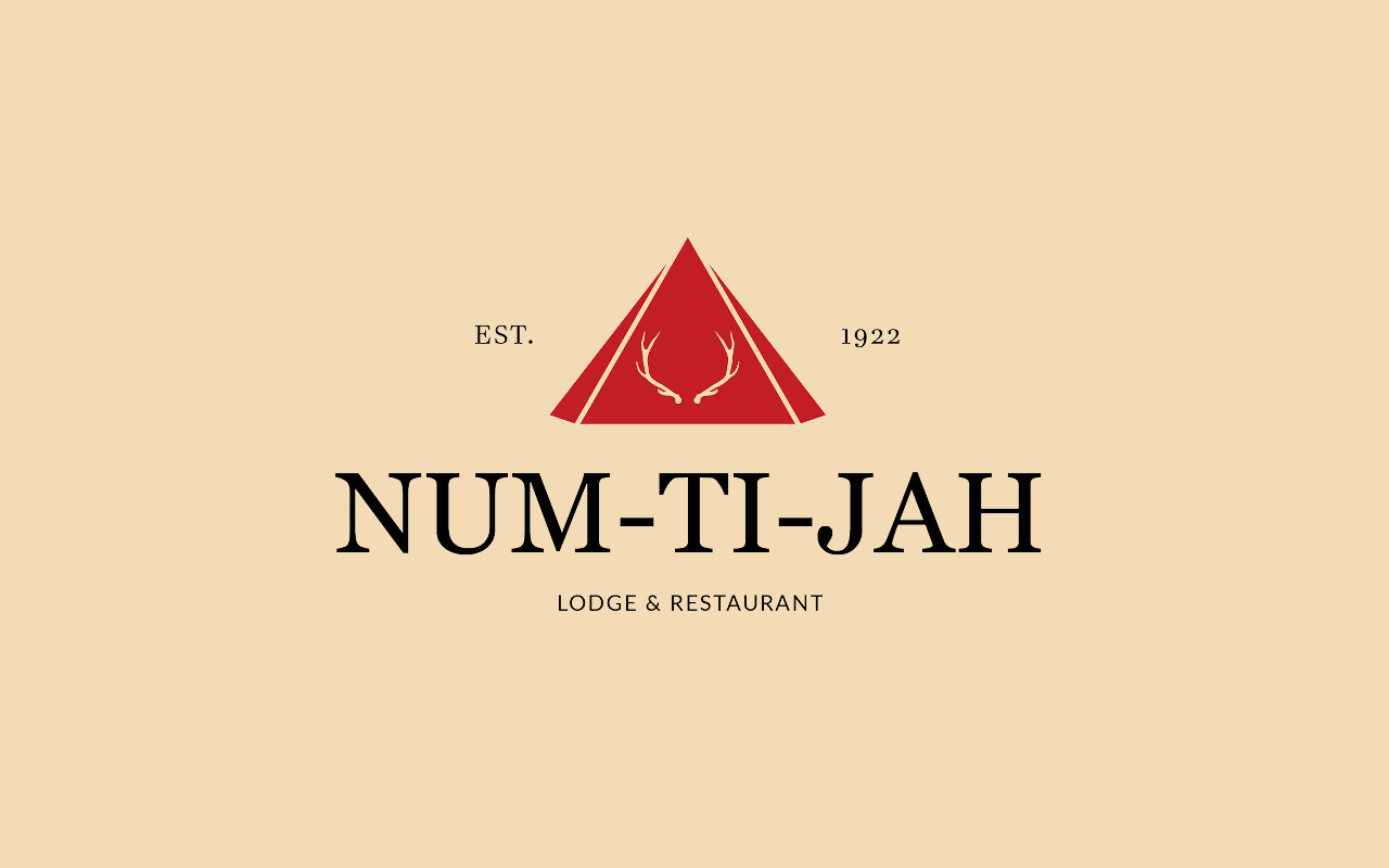
Old Logo → New Logo
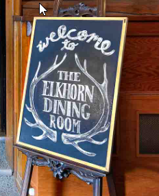
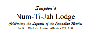
Num-Ti-Jah Lodge hadn’t had any branding or logo since being taken over in ownership in the 90’s. Num-Ti-Jah used deer antlers in most merchandise, serif fonts and used the header below for all written correspondence.
Dining Room Sign
Written correspondence header
The owner wanted to incorporate the deer antlers from the previous design and give it a modern, sleek look that appeals to a younger audience.
The logo features a simplified and stylized representation of deer antlers within the iconic red roof. The antlers are streamlined and modernized, with clean lines and minimal details, creating a sleek and contemporary aesthetic.
Website Design
Inspired by the picturesque beauty of our surroundings, our website captures the essence of Num-Ti-Jah Lodge through a harmonious blend of simple green, reds, and yellows. These vibrant colors pay homage to the lush forests, vibrant sunsets, and golden hues that grace the Canadian Rockies.
Escape. Reconnect. Discover. Our simple design elements allow the lodge’s elegance to shine through. Clean lines and intuitive navigation ensure that your online experience reflects the seamless hospitality you can expect during your stay. The website’s layout beautifully balances functionality and aesthetics, making it easy for you to explore the diverse offerings at Num-Ti-Jah Lodge.
Hotel Merchandise
As a passionate designer, I embarked on a creative journey to curate a collection that exudes elegance and serves a distinct purpose for guests and the hotel alike. From scented candles that create a soothing ambiance to exquisite mugs designed for moments of indulgence, every item was carefully selected to enhance the hotel experience. Plush slippers were meticulously crafted to envelop guests in ultimate comfort, while moisturizers, shampoo, and conditioner were specially formulated to rejuvenate and nourish their skin and hair.
The stationery collection offers a canvas for creativity and sophistication, while the business cards reflect the hotel’s style and attention to detail. Signature soaps provide a moment of indulgence during bathing, and meticulously embroidered bathrobes offer a haven of relaxation. The collection also includes fluffy towels and other carefully chosen amenities that ensure each guest’s experience is extraordinary.
In essence, this collection represents a dedication to elevating the guest experience, providing them with tangible comforts and luxurious touches throughout their stay. From the flickering flame of a scented candle to the gentle embrace of a plush robe, every item invites guests to immerse themselves in a world of elegance and tranquility.
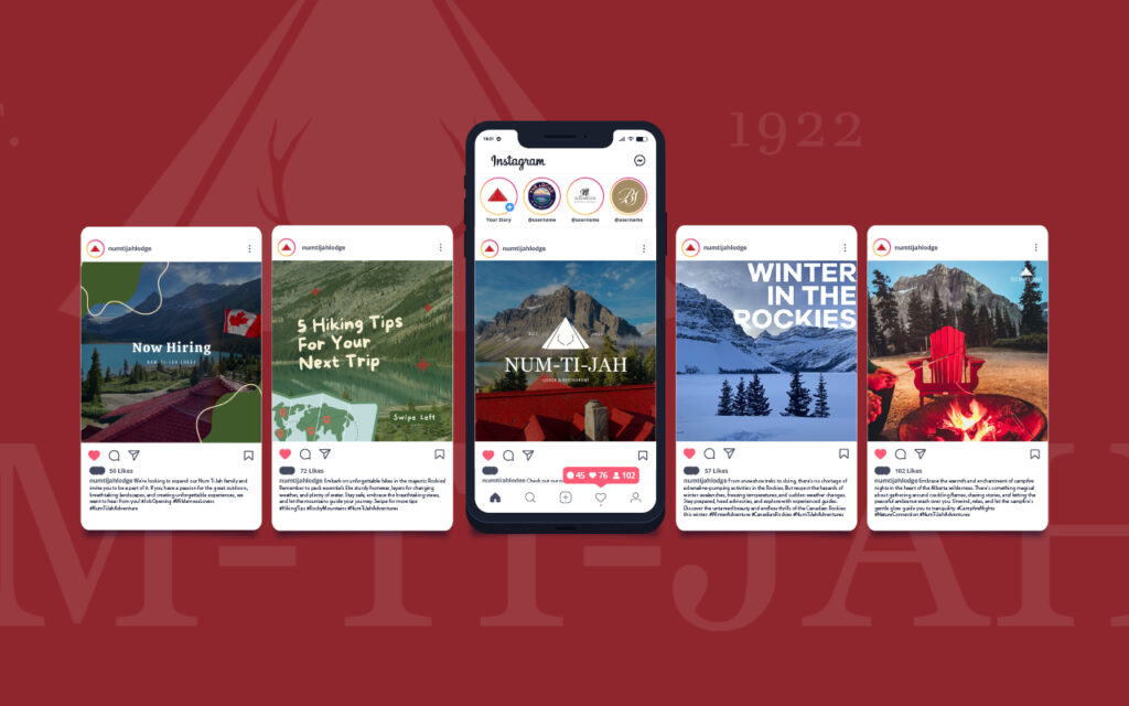
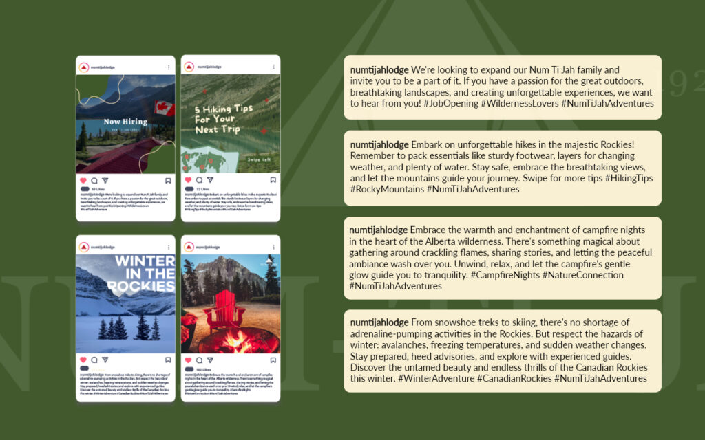
Social Media Strategy
Through our carefully crafted social media content, we transported our followers on a virtual journey, showcasing the untamed wonders surrounding our lodge. We captured and shared stunning photography and videos that highlighted the majesty of the Rocky Mountains, pristine lakes, and vibrant wildlife, allowing our audience to experience the tranquility and adventure that awaited them here.
Our strategy went beyond visuals. We also provided insider tips, revealing hidden gems, hiking trails, and activities that made each visit to Num-Ti-Jah Lodge truly exceptional. Our local experts shared their knowledge to help our audience make the most of their wilderness adventure.
Engaging stories played a vital role in our campaign, as we shared captivating tales of our guests’ memorable experiences and encounters with wildlife. We brought the spirit of adventure to life, encouraging our followers to engage with us and share their own outdoor tales.
Throughout our campaign, we also offered exclusive promotions, providing our social media community with the first look at special offers, seasonal packages, and exciting events happening at Num-Ti-Jah Lodge. We created a sense of belonging, fostering a vibrant community of nature lovers who came together to celebrate the magic of rural Alberta.
We are proud of the community we built, connecting with fellow outdoor enthusiasts through user-generated content. Our audience tagged us in their photos, used our branded hashtag #NumTiJahAdventures, and helped us create a space where the beauty of nature was shared and celebrated.
Through our past social media strategy, we successfully rejuvenated, inspired, and connected with our audience. Our content showcased the wonder of rural Alberta and the unique experience offered at Num-Ti-Jah Lodge. 🌿🏔️